
Linear Regression Part 2 - Potential Modeling Problems
Introduction
Linear Regression is the linear approach to modeling the relationship between a quantitative response () and one or more explanatory variables (); also known as Response and Features, respectively.
This post focuses on the potential modeling problems that might arise due to the required assumptions for Linear Regression.
The code for this post can be found in this Notebook.
Let’s load the data and necessary libraries. The toy dataset used in this example contain information on house prices and its characteristics, such as Neighborhood, square footage, # of bedrooms and bathrooms.
import pandas as pd
import numpy as np
import seaborn as sns
import matplotlib.pyplot as plt
import statsmodels.api as sm
%matplotlib inline

df = pd.read_csv('house_prices.csv')
df.drop(columns='house_id', inplace=True)
df.head(3)
| neighborhood | area | bedrooms | bathrooms | style | price | |
|---|---|---|---|---|---|---|
| 0 | B | 1188 | 3 | 2 | ranch | 598291 |
| 1 | B | 3512 | 5 | 3 | victorian | 1744259 |
| 2 | B | 1134 | 3 | 2 | ranch | 571669 |
Now let’s fit the final model identified in the Part 1 of Linear Regression series:
# Creating dummy variable for Neighborhoods
df = df.join(pd.get_dummies(df.neighborhood, prefix='neighb'))

# Creating interaction term to be incorporated in the model
df['area_neighb'] = df.area * df.neighb_B

df['intercept'] = 1
features_list = ['intercept', 'area','neighb_B','area_neighb']

model = sm.OLS(df.price, df[features_list])
fitted_model = model.fit()
fitted_model.summary2()
| Model: | OLS | Adj. R-squared: | 1.000 |
| Dependent Variable: | price | AIC: | 71986.6799 |
| Date: | 2019-04-10 10:22 | BIC: | 72013.4966 |
| No. Observations: | 6028 | Log-Likelihood: | -35989. |
| Df Model: | 3 | F-statistic: | 6.131e+10 |
| Df Residuals: | 6024 | Prob (F-statistic): | 0.00 |
| R-squared: | 1.000 | Scale: | 8986.8 |
| Coef. | Std.Err. | t | P>|t| | [0.025 | 0.975] | |
|---|---|---|---|---|---|---|
| intercept | 12198.0608 | 3.1492 | 3873.3747 | 0.0000 | 12191.8872 | 12204.2343 |
| area | 248.1610 | 0.0013 | 194094.9191 | 0.0000 | 248.1585 | 248.1635 |
| neighb_B | 132.5642 | 4.9709 | 26.6682 | 0.0000 | 122.8195 | 142.3089 |
| area_neighb | 245.0016 | 0.0020 | 121848.3887 | 0.0000 | 244.9976 | 245.0055 |
| Omnibus: | 214.393 | Durbin-Watson: | 1.979 |
| Prob(Omnibus): | 0.000 | Jarque-Bera (JB): | 398.418 |
| Skew: | -0.277 | Prob(JB): | 0.000 |
| Kurtosis: | 4.131 | Condition No.: | 12098 |
Potential Modeling Problems
Depending on the main objective of your model (prediction, inference, most important features), you might need to address some specific problems - but not necessarily all of them.
These are the potential problems related to Multiple Linear Regression assumptions: some should be checked when choosing the predictors for the model; others only after the model has been fitted - while some should be checked in both situations.
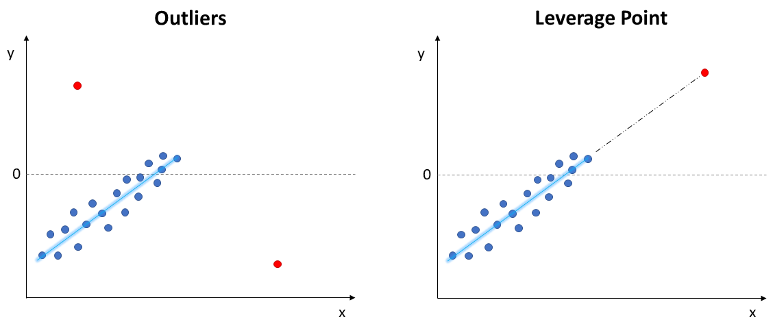
1. Outliers & Leverage Points
Outliers and leverage points lie far away from the regular trends of the data. These points can have a large influence on the fitted model and the required assumptions, such as linearity and normality of errors. Therefore, this should be the very first step to check when fitting a model.
- Outliers: extreme values on the y axis, do not follow the trend
- Leverage Points: follows the trend, but extreme values on the x axis
Most of the time, these points are resulted by typos (data entry), malfunctioning sensors (bad data collected), or even just extremely rare events.
These cases can be removed from the dataset or inputed using k-nearest neighbors, mean, or median.
Other times, these are actually correct and true data points (known as Natural Outliers), not necessarily measurement or data entry errors.
This situation would not call for removal, instead it requires further exploration to better understand the data. For example, fraud detection goal is exactly identifying extreme out-of-pattern transactions.
‘Fixing’ is more subjective. If there is a large number of outliers, it is advised to create separate models.
There are many techniques to combat this, such as regularization techniques (Ridge, Lasso regression) and more empirical methods.
Regularization significantly reduces model variance without substantial impact on bias. But their implementation is more complex and will be covered in a future post.
For now, we can focus on the more pragmatical methods:
- Tukey’s Fence
- Standardized Residuals
- Outliers Removal Strategy
- Unsupervised Outlier Detection:
- Isolation Forest
- Local Outlier Factor
- Deleted Residuals:
- Difference in FITS
- Cook’s Distance
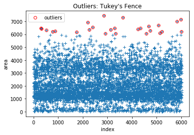
1.1) Tukey’s Fence
Applied on predictors individually. Typically represented in a Box-Plot, values more extreme than the lower and upper boundaries of Tukey’s fence are considered outliers and should be further investigated:
- Calculate the first and third quartiles, and
- Calculate the Inter-Quartile Range,
- Remove values more extreme than upper and lower boundaries:
- Upper:
- Lower:
Note: it is important to note this method is commonly used, but only captures extreme values for univariate distribution. It is important to investigate multivariate distribution as well.
def outlier_Tukeys_Fence(df, variable, factor=1.5, drop_outliers=False):
    Q3 = df[variable].quantile(0.75)
    Q1 = df[variable].quantile(0.25)
    IQR = Q3 - Q1
    ...

df2 = df.copy()
len(df2)
6028
outlier_Tukeys_Fence(df2, 'area', drop_outliers=True)
len(df2)
Boundaries: [-1,631.0 | 5,985.0]
Points outside Upper Fence: 26
Points outside Lower Fence: 0
6002
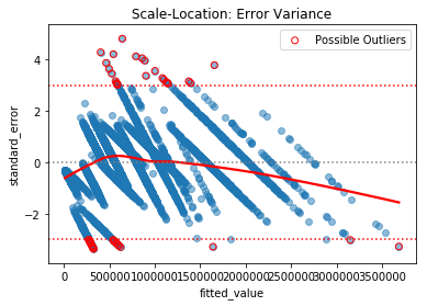
1.2) Standardized Residuals
Applied on the final model. A slight twist on the typical plot of Residuals by Fitted values. This method uses the standardized residual instead - which is obtained by dividing the error by the standard deviation of errors,
- Outliers: Values more extreme than 3 standard deviation, since they represent 99.7% of data.
def outliers_Standard_Error(df, fitted_model=fitted_model):
    # Standardized Error: absolute values > 3 means more extreme than 99.7%
    df['error'] = fitted_model.resid
    df['fitted_value'] = fitted_model.fittedvalues
    df['standard_error'] = df.error/np.std(df.error)
    ...

outliers_Standard_Error(df)
Points > 3 Std: 24
Points < -3 Std: 28
Total of possible outliers: 52
1.3) Outliers Removal Strategy
This more generalized strategy can be implemented in any model and repeated multiple times, until the best model fit is found:
- Train the model over all data points from the Train dataset
- Remove 10% points with largest residual error
- Re-train the model and evaluate against the Test dataset
- Repeat from step 2, until best model fit is found
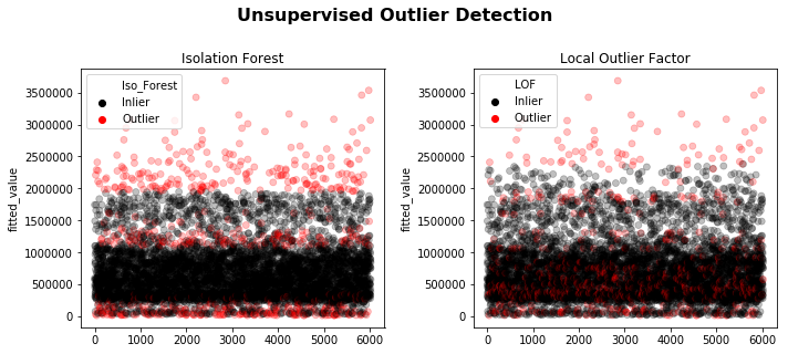
1.4) Unsupervised Outlier Detection
Two of the most used unsupervised methods are Isolation Forest & Local Outlier Factor. See linked documentation for detailed explanation.
The downside of such advanced multivariate methods (random tree and density based) is the requirement to arbitrarily specify the contamination factor - that is, the percentage of dataset believed to be “bad”.
It should be implemented iteratively using the Outliers Removal Strategy (evaluating model performance against a test set).
from sklearn.ensemble import IsolationForest
from sklearn.neighbors import LocalOutlierFactor

# percentage of dataset 'contaminated' with outliers
contamination_factor = 0.1

algorithm_list = [
("Isolation Forest", IsolationForest(behaviour='new',contamination=contamination_factor,random_state=42), 'Iso_Forest'),
("Local Outlier Factor", LocalOutlierFactor(n_neighbors=35, contamination=contamination_factor), 'LOF')]

# X = df[features_list]
X = df[['price', 'area', 'neighb_B', 'area_neighb']]
counter = 0

fig, ax = plt.subplots(1,2, figsize=(10,4))

for name, model, tag in algorithm_list:
    # Apply unsupervised method and store classification: 1 = Inliner; -1 or 0 = Outlier
    df[f'{tag}'] = model.fit_predict(X)

    # Rename for legend purpose
    df[f'{tag}'] = np.where(df[f'{tag}'] == 1, 'Inlier', 'Outlier')

    sns.scatterplot(df.index, df.fitted_value, hue=df[f'{tag}'], alpha=0.25, palette=['k','r'], ax=ax[counter], edgecolor=None)

    ax[counter].set_title(f'{name}');

    # Amount of Outliers (dataset size * contamination_factor)
    outliers = len(df.query(f'{tag} == "Outlier"'))
    print(f'{name} | Outliers detected = {outliers:,}')

    counter += 1

plt.tight_layout()
fig.suptitle('Unsupervised Outlier Detection', size=16, weight='bold', y=1.1);
Isolation Forest | Outliers detected = 602
Local Outlier Factor | Outliers detected = 603
1.5) Deleted Residuals
The previous methods can be biased, since the model has been fitted using the entire dataset (extreme values included - if any). The alternative is a systematic approach of withholding one observation, fitting the model and calculating a specific metric - repeating the process for the entire data set.
The interpretation follow each metric specific “guideline”:
- Difference in Fits (DFFITS): values that stick out from the others are potentially influential extreme data points
- Cook’s Distance:
- : might be influential points. Further investigate
- : data point likely to be influential
Influential: data points extreme enough to significantly impact the fitted model results, such as coefficients, p-value, and Confidence Intervals.
1.5.1) Difference in Fits (DFFITS)
Values that stick out from the others are potentially influential extreme data points:
def outliers_DFFITS(df, fitted_model=fitted_model):
    df['dffits'] = fitted_model.get_influence().dffits[0]
    ...

outliers_DFFITS(df)
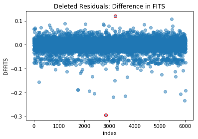
In this example, there are no points sticking out significantly more than the others, suggesting there are no influential extreme data points.
1.5.2) Cook’s Distance
- : might be influential points. Further investigate
- : data point likely to be influential
def outliers_Cooks_Distance(df, fitted_model=fitted_model):
    df['cooks_distance'] = fitted_model.get_influence().cooks_distance[0]

    # Plotting
    df.cooks_distance.plot(style='o', alpha=0.5, label='Not Influential')
    try:
        df.query('cooks_distance > 0.5').cooks_distance.plot(style='r',mfc='none',label='Possible Influential')
        plt.axhline(0.5, color='r', ls=':')

        df.query('cooks_distance > 1').cooks_distance.plot(style='r',label='Influential')
        plt.axhline(1, color='darkred', ls='--')
    except:
        pass
    ...

outliers_Cooks_Distance(df)
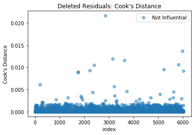
In this example, there are no points with Cook’s distance greater than 0.5, suggesting there are no influential extreme data points.
2. Multicollinearity
One of the major 4 assumptions of Linear Regression, it assumes the (linear) independence between predictors. That is, it is not possible to infer one predictor based on the others.
Ultimately, we want the explanatory variables (predictors) to be correlated to the response, not between each other.
In the case of correlated features being used simultaneously as predictors, the model can yield:
- Inverted coefficient sign from what we would expect
- Unreliable p-value for the Hypothesis Test of variable coefficient being significantly 0
To investigate and identify multicollinearity between explanatory variables, we can use two approaches:
- Visual
- Metric:
- Correlation Coefficient,
- Variance Inflation Factor (VIF)
Hint: Multicollinearity should be checked while choosing predictors: the modeling goal is to identify relevant features to the response, that are independent from each other.
2.1) Bivariate Plot (between Predictors)
Scatter plot between two variables looking for any relationship (positive or negative):
# Visually investigating relationship between features
chart = sns.pairplot(data=df[['area', 'bedrooms', 'bathrooms', 'price']], kind='reg')
chart.fig.suptitle('Bivariate Plot: correlation between variables', y=1.02);
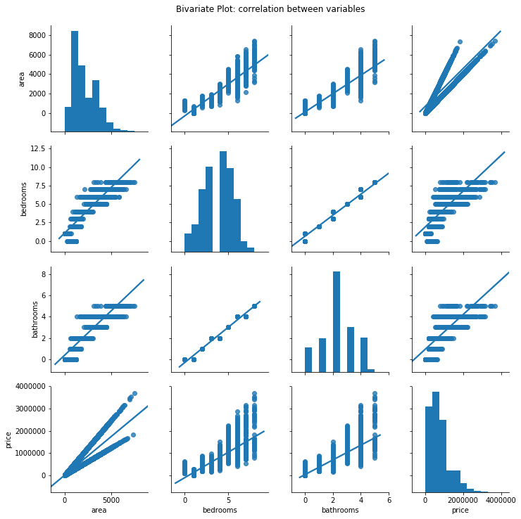
It is possible to see the quantitative variables are correlated to each other, having a positive linear relationship.
2.2) Pearson’s Correlation Matrix (Heatmap)
def Correlation_Heatmap(df, variables_list=None, figsize=(10,8)):
    # Generate mask to hide the upper triangle/diagonal
    mask = np.zeros_like(corr, dtype=np.bool)
    mask[np.triu_indices_from(mask)] = True

    # Draw heatmap with mask
    sns.heatmap(corr, mask=mask, cmap=cmap, vmin=-1,vmax=1, center=0,square=True, annot=np.where(abs(corr)>0.1, corr,0),linewidths=0.5, cbar_kws={"shrink": 0.75})
    ...

Correlation_Heatmap(df, ['area','bedrooms','bathrooms', 'price'], figsize=(8,5))
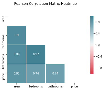
According to the Pearson Correlation coefficient, the variable area is strongly correlated to bedrooms (0.9) and bathrooms (0.89), meaning we should use only 1 of these variables in the model.
The response price is strongly positively correlated to all quantitative variables, with area (0.82) stronger than bedrooms and bathrooms (0.74).
Which suggests we should choose area as our predictor.
2.3) Variance Inflation Factor (VIF)
The general rule of thumb is that VIFs exceeding 4 warrants further investigation, while VIFs exceeding 10 indicates serious multicollinearity, requiring correction:
# Metric investigation of correlation: VIF
def VIF(df="df", model_formula="y ~ x1 + x2 + x3"):
    from statsmodels.stats.outliers_influence import variance_inflation_factor

    y,X = dmatrices(model_formula, df, return_type='dataframe')
    vif = DataFrame()
    ...

model_formula = 'price ~ area + bedrooms + bathrooms'
VIF(df, model_formula)
| VIF | feature | |
|---|---|---|
| 0 | 7.327102 | Intercept |
| 1 | 5.458190 | area |
| 2 | 20.854484 | bedrooms |
| 3 | 19.006851 | bathrooms |
Looks like there is a serious sign of multicollinearity between the explanatory variables. Let’s remove the highest one, bedrooms and recalculate the VIF:
# Removing correlated features: bedrooms
model_formula = 'price ~ area + bathrooms'
VIF(df, model_formula)
| VIF | feature | |
|---|---|---|
| 0 | 4.438137 | Intercept |
| 1 | 4.871816 | area |
| 2 | 4.871816 | bathrooms |
Removing bedrooms has improved the multicollinearity condition, but we still have bathrooms with a value greater than 4 - which warrants further investigation.
Since our previous analysis using the Pearson correlation coefficient showed bathroom to be strongly correlated to area, let’s remove it and calculate the VIF one more time:
# Removing correlated features
model_formula = 'price ~ area'
VIF(df, model_formula)
| VIF | feature | |
|---|---|---|
| 0 | 3.98224 | Intercept |
| 1 | 1.00000 | area |
As expected, since we are only using one explanatory variable, the VIF reaches it’s lowest possible value of 1. In this case, amongst all quantitative variables, we should regress our model using only the area.
3. Linearity
The main assumption of Linear Regression, there should be a linear relationship that truly exists between the response and the predictor variables . If this isn’t the case, the predictions will not be accurate and the interpretation of coefficients won’t be useful.
We can verify if a linear relationship is reasonable by analyzing two plots:
- Pair Plot
- Residual Plot
Residuals can be understood as the model error.
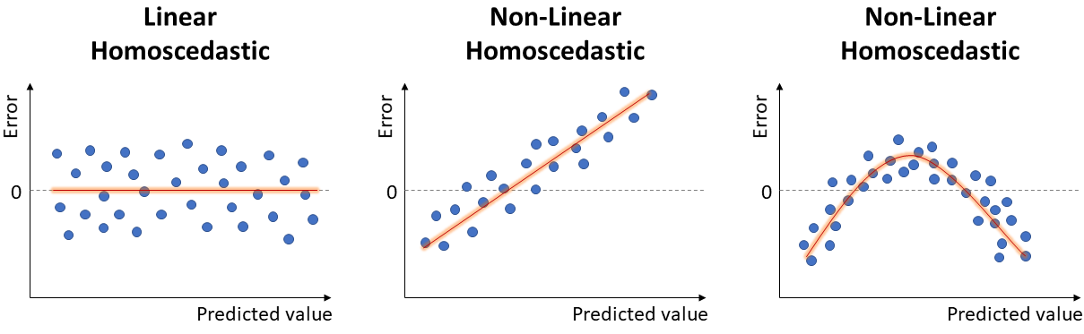
Ideally, the error would be randomly scattered around 0, as seen in the left-most case in the image below.
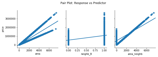
3.1) Pair Plot (Response vs Predictor)
Bivariate plot between the response and each individual predictor. There should be some kind of linear relationship, either positive or negative.
# Pairplot of y vs. X
chart = sns.pairplot(df, x_vars=['area', 'neighb_B', 'area_neighb'], y_vars='price', kind='reg', height=3)
chart.fig.suptitle('Pair Plot: Response vs Predictor', y=1.1);
3.2) Residual Plot
Plot of residuals, by the predicted values, . Should be randomly scattered around 0.
If there is any kind of structure/pattern, it suggests there is some other relationship between the response and the predictors, violating the Linearity assumption and compromising the model.
def residual_plot(df, fitted_model=fitted_model):
    df['error'] = fitted_model.resid
    df['fitted_value'] = fitted_model.fittedvalues

    sns.regplot(y=df.error, x=df.fitted_value, lowess=False,line_kws={'color':'red'}, scatter_kws={'alpha':0.5})
    plt.axhline(0, color='gray', ls=':')
    plt.title('Residual Plot');

plt.figure(figsize=(8,4))
residual_plot(df, fitted_model)
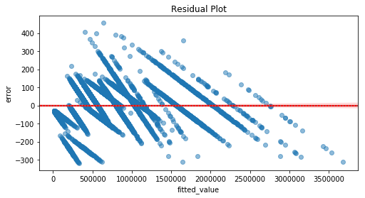
The residuals are not randomly scattered around 0. Indeed, there is some kind of pattern/structure. Hence, it violates the Linearity assumption, compromising the model.
One could make use of data transformation (predictor, response, or both) or add new predictors (higher order, interaction term) in order to satisfy the Linearity assumption:
-
Natural Log transformation: only for positive values, spread out small values and bring large values closer. Appropriate for skewed distribution.
-
Reciprocal transformation: applied on non-zero variable, appropriate for highly skewed data, approximating it to a normal distribution
-
Square Root: only for positive values, appropriate for slightly skewed data.
-
Higher Order: applied for negative values, appropriate for highly left-skewed distribution.
-
Box-Cox technique: this technique allows to systematically test the best parameter in the power transformation. Ultimately, it identifies the best type of transformation to be applied in order to approximate the variable to a normal distribution.
Hint: when dealing with negative values, add a constant to the variable in order to transform it into positive values before using Box-Cox technique.
It is important to highlight that, after transforming a variable, it is necessary to “transform it back” when calculating Confidence Intervals, and the interpretation of coefficients might change from additive ( units change per 1 unit increase) to multiplicative ( % change due to 1% increase).
As a matter of fact, you should not move forward to verify other assumptions before making sure Linearity holds. Otherwise, the model will not yield useful results and will be limited to the scope of data in which it was trained - no extrapolation.
Attention: this post focuses on the Potential Modeling Problems. Fixing the Linearity issue is not trivial and we will not address it at this time.
A full project will be covered in another post, implementing Data Wrangling, Exploratory Data Analysis (EDA), Feature Engineering, and Model Regression & Performance Evaluation.
4. Correlated Residuals
It frequently occurs if the data is collected over time (stock market) or over a spatial area (flood, traffic jam, car accidents).
The main problem here is failing to account for correlated errors since it allows to improve the model performance by incorporating information from past data points (time) or the points nearby (space).
In case of serial correlation, we can implement ARMA or ARIMA models to leverage correlated errors to make better predictions.
We can check for autocorrelation using two methods:
- Durbin-Watson Test
- Residual vs. Order Plot
- Autocorrelation Plot
4.1) Durbin-Watson Test
We can verify if there are correlated errors by interpreting the Durbin-Watson test - which is available in the statsmodels result summary:
- verifies if there is serial correlation between one data point () and its previous (-1) - called lag - over all residuals (, )
- Test statistic varies between [1 - 4]
- Test = 2 0.6: no correlated errors
- Test < 1.4: positive correlation between errors
- Test > 2.6: negative correlation between errors
In our example, the Durbin-Watson test value of 1.979 is quite close to 2, suggesting there are no auto-correlated errors.
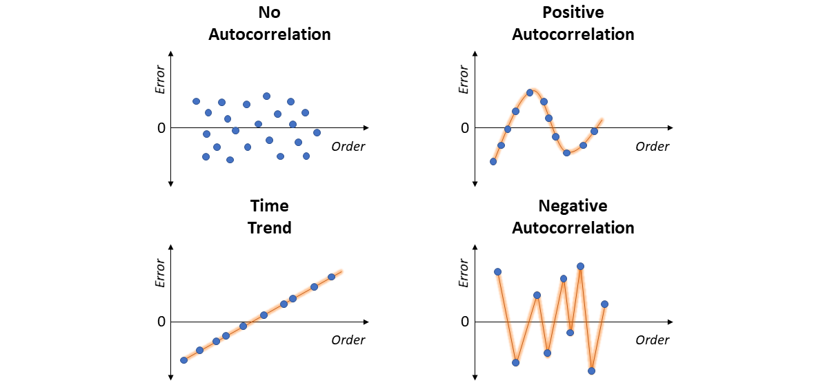
4.2) Residual vs. Order Plot
If the order/sequence in which the data were collected is known, it is possible to visually assess the plot of Residuals vs. Order (of data collection).
- No Correlation: residuals are randomly scattered around 0.
- Time Trend: residuals tend to form a positive linear pattern (like a diagonal). One should incorporate “time” as a predictor - and move to the realm of Time Series Analysis.
- Positive Correlation: residuals tend to be followed by an error of the same sign and about the same magnitude, clearly forming a sequential pattern of smoothed ups and downs (like a sine curve). Once again, in this case one should move to Time Series.
- Negative Correlation: residuals of one sign tend to be followed by residuals of the opposite sign, forming a sharp zig-zag line (like a W shape). Just as well, move to Time Series Analysis.
4.3) Autocorrelation Plot
If most of residual autocorrelation falls within the 95% Confidence Interval band around 0, no serial correlation.
from statsmodels.graphics.tsaplots import plot_acf
from statsmodels.graphics.tsaplots import plot_acf
plot_acf(df.error, lags=30, title='Autocorrelation Plot')
plt.xlabel('Lag value')
plt.ylabel('Correlation');
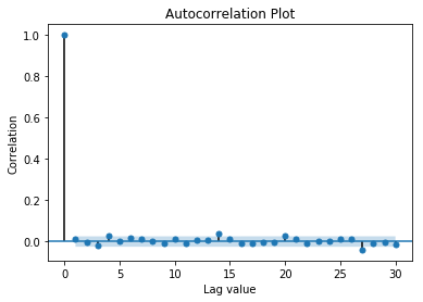
In this example, the data is not autocorrelated.
5. Normality of Residuals
Another assumption of Linear Regression, the residuals should be normally distributed around 0. This is important to achieve reliable Confidence Intervals.
This particular problem doesn’t significantly impact the prediction accuracy. But it leads to wrong p-values and confidence intervals when checking if coefficients are significantly different than 0. This compromises the model inference capability.
We can verify if normality of residuals is reasonable by analyzing it visually or using statistical tests:
- Visually:
- Histogram
- Probability Plot
Another possibility is that there are two or more subsets of the data having peculiar statistical properties, in which case separate models should be built.
It is also important to highlight this assumption might be violated due to the violation of Linearity - which would call for transformation.
You would transform the response, individual predictors, or both, until the Normality of Residuals is satisfied. Note the variables per se don’t need to be normally distributed: the focus here is on the distribution of Residuals.
Note: Afterwards, it is necessary to go back and check if Linearity with the new transformations still holds true.
In some cases, the problem with the error distribution is mainly due to few very large errors (influential data points). Such data points should be further investigated and appropriately addressed, as covered in the Outliers and Leverage Point section.
5.1) Histogram of Residuals
Visually check if the data is normally distributed (bell shape), skewed, or bi-modal:
sns.distplot(df.error, hist_kws={'edgecolor':'gray'})
plt.ylabel('Density')
plt.title('Histogram');
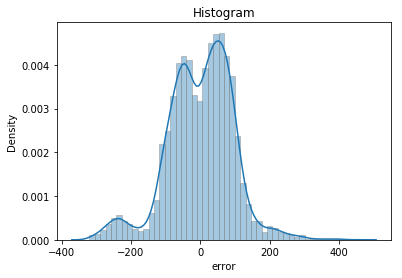
The histogram does not present the well-behaved Bell shape. Hence, this is not a normal distribution. More like bimodal.
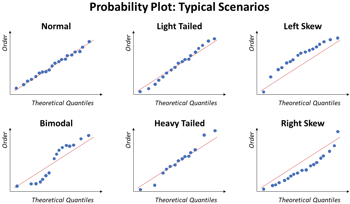
5.2) Probability Plot of Residuals
Also known as QQ plot, this approach is better for small sample size. Different than Histogram, this plot allows to clearly identify values far from the Normal.
Ideally, the points will fall over the diagonal line.
The image below illustrate some of the typical trends of a Probability Plot under specific situations: Normal, Bimodal, Light Tail, Heavy Tail, Left Skew, and Right Skew:
def ProbPlot(df, fitted_model, ax=None):
    from scipy.stats import probplot
    df['error'] = fitted_model.resid
    ...

ProbPlot(df, fitted_model);
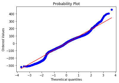
The points do not follow the diagonal line. As a matter of fact, it is possible to make out an stretched “S” form with gaps on the both extremities, suggesting the distribution to be bimodal.
Which seems reasonable when looking at the previous histogram plot.
5.3) Statistical Tests
Some methods testing the Null Hypotheses of data being Normal. If low p-value, suggests data does not likely come from a normal distribution.
- Shapiro-Wilk:
from scipy.stats import shapiro - D’Agostino:
from scipy.stats import normaltest - Jarque-Bera:
from scipy.stats import jarque_bera. Recommended only for datasets larger than 2,000 observations. Already included instatmodelsresult summary.
Note: Statistical tests are not recommended for datasets larger than 5,000 observations.
def Normality_Tests(variable, alpha=0.05):
    from scipy.stats import shapiro, normaltest, jarque_bera

    normality_tests = {'Shapiro-Wilk': shapiro, 'D\'Agostino': normaltest,'Jarque-Bera': jarque_bera}

    for name,test in normality_tests.items():
        stat, p = test(variable)
        print(f'{name} Test: {stat:.3f} | p-value: {p:.3f}')
        ...

Normality_Tests(df.error)
Shapiro-Wilk Test: 0.978 | p-value: 0.000
–> Reject the Null: not likely Normal Distribution
D’Agostino Test: 214.393 | p-value: 0.000
–> Reject the Null: not likely Normal Distribution
Jarque-Bera Test: 398.418 | p-value: 0.000
*Recommended for dataset > 2k observations
–> Reject the Null: not likely Normal Distribution
Since our dataset has over 6,000 observations, the function throws a warning message: statistical tests for normality are not suitable for such large dataset (> 5,000 rows).
As explained in a previous post, hypothesis testing on large sample sizes leads to even the smallest difference being considered significant. Hence, being unreliable.
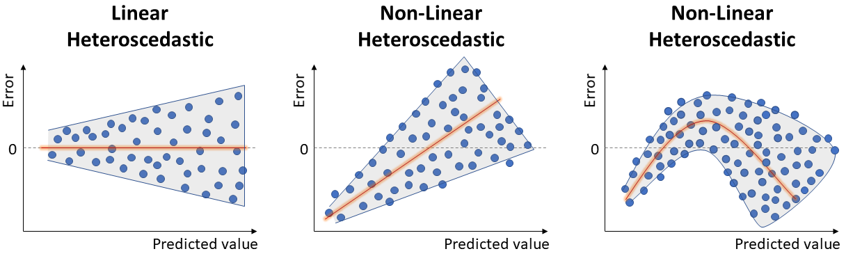
6. Constant Variance of Residuals
Another Linear Regression assumption: the variance of errors should not change based on the predicted value. We refer to non-constant variance of errors as heteroscedastic.
This particular problem doesn’t significantly impact the prediction accuracy. But it leads to wrong p-values and confidence intervals, invalidating the basic assumption for Linear Models and compromising the model inference capability.
This can be verified by looking again at the plot of residuals by predicted values. Ideally, we want an unbiased model with homoscedastic residuals (consistent across the range of predicted values), as seen in the image of Linearity.
Below, we can see examples of heteroscedasticity:
To address heteroscedastic models, it is typical to apply some transformation on the response, to mitigate the non-constant variance of errors:
-
Natural Log transformation: only for positive values, spread out small values and bring large values closer. Appropriate if the variance increases in proportion to the mean.
-
Reciprocal transformation: applied on non-zero variable, appropriate for very skewed data, approximating it to a normal distribution.
-
Square Root: only for positive values, appropriate if variance changes proportionately to the square root of the mean.
-
Higher Order: appropriate if variance increases in proportion to the square or higher of the mean.
-
Box-Cox technique: this technique allows to systematically test the best parameter in the power transformation. Ultimately, it identifies the best type of transformation to be applied in order to approximate the variable to a normal distribution.
Hint: when dealing with negative values, add a constant to the variable in order to transform it into positive values before using Box-Cox technique.
residual_plot(df, fitted_model)
Because the lack of linearity dominates the plot, we cannot use this Residual Plot to evaluate whether or not the error variances are equal.
It would be necessary to fix the non-linearity problem before verifying the assumption of homoscedasticity. Since this falls outside the scope of this post, it will not be covered.
Conclusion
In this post we reviewed some of the potential modeling problems regarding the basic assumptions required for Regression models, covering some strategies on how to identify and address them. Namely, 1) Outliers and Leverage Points, 2) Multicollinearity, 3) Linearity, 4) Correlated Errors, 5) Normality of Residuals, and 6) Constant Variance of Errors.
In the next post (Part 3), we will introduce the basics of Logistic Regression (when to use it, how to interpret the results) and how to evaluate Model Performance (accuracy, precision, recall, AUROC etc.).
As always, constructive feedback is appreciated. Feel free to leave any questions/suggestions in the comments section below!